
In the previous part of this topic we saw some of the basic rules for composing a picture. Composition, in photography, is the language that we use to write the history we desire to transmit, the syntax that we use to join our ideas together. Those rules were the most basic “phrases” that we can use to transmit some meaning to our viewers.
It is clear that for the same scene many different pictures can be taken. Some of those pictures will differ only in their technical parameters, but most of them will use different approaches, planes, and compositions to capture what it is seen. The difference between a standard picture and an appealing one is the use of an attractive composition. The rules we saw in the previous part were the basic ones, those that will turn a bad picture into a decent one. Of course, those are not the only rules we have. History, through art, has shown us many different patterns that work very well to attract the attention of the spectator. We are not bound to use them if we don’t want to (perhaps we don’t like the effect that some composition provides, or perhaps we simply consider that the rule doesn’t apply well to a specific picture). The point is that, having those rules in our toolbox, we will be able to use them when we consider that they will improve the result. When trying to compose a picture is always useful to have some references to start trying. Perhaps following them step by step is not the best choice, but having them as a “map” to follow will allow to expand our creativity as photographers.
Framing:
One of the things that tend to catch the attention of the eye is a picture inside a picture. This can be, of course, in a literal way, taking a picture of a scene that has already a picture on it. But it also works very well on a metaphorical way. One way to achieve this is to surround the scene by a frame, natural or artificial. This frame can be anything, like some trees or branches, a wall (or a hole in it), a space left by a group of people… Just surrounding the scene with anything will increase the attractiveness.
Different approaches are possible, and many of them popular. For example, you can take a picture of a landscape from a window, making sure that the frame of the window is not caught. This will yield a clean picture. The other option is to close the window and take the picture of the landscape through it (being sure that no undesired reflections appear on the glass), in a way that the window and a part of the wall are shown. This way the window hole works as a frame, concealing the landscape and also including a context for the picture.
A different example can be a picture of an open door from inside a church (or any other low light building). Adjusting the exposure to the inside illumination will yield a good picture of the inside with the outside scene burnt. Exposing to the outside opens new possibilities. The inside will be dark, but the door silhouette will act as a frame for the outside scene, that will appear clear and sharp.
This relates with the negative space topic. The negative space happens when we don’t transmit our idea with the elements that we have in the picture, but with the gap they leave, or an absence. The mind is able to create a concept from the details that are not there. This is an extreme point of this rule, where the main elements are used as a frame for a concept or idea that is not there. For example, when photographing a crowd of people from upside, it is possible that a gap left by the people of the crowd has a recognizable shape, e.g. the silhouette of a person. This would create a message (the person) inside the main message (the crowd) by the absence of some people.
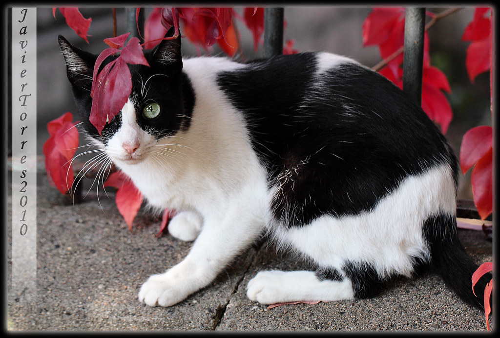
In this case the picture of the cat increases its appeal with the intense red leaves that surround the picture, acting as a frame. The “frame” doesn’t need to be perfect in order to be recognizable.
Direction of movement:
When taking a picture of a subject in movement, it is a good idea to leave some space on the side it is moving to. This rule works well in combination with the thirds rule. For example, if a car is moving from the left to the right side of the picture it is usually a better idea to place the car on the left third line and leave the right third of the picture empty. This way it transmits the idea that the car is moving to this place. Even if the car is completely static in our picture (fast shutter speeds), the idea of movement is there, because we can identify the front and the back of it. Inverting this pattern would be a good idea if we wanted to transmit the idea that the car is moving backwards.
This is important even with static subjects. For example, when taking a portrait or the picture of a person, is a good idea to leave some space in the direction s/he looking at. This way we can transmit the idea that there is something interesting in this direction. For an increase in effect, you can align the eye to one of the thirds intersections.
This rule can be broken when the composition requires it. For example, leaving space behind a moving person can transmit the “leaving” concept, abandoning something behind. Not leaving space in the direction that is looking, or concealing the person in the frame tightly, can transmit stress, paranoia or oppression. It is a good resource to communicate emotions.
Also, this rule can also be used in the inverse meaning, transmitting a message in an ambiguous scenery. Imagine a picture of one person, and two objects. The person is looking at them, and there is no clue in the scene to show which one of them is the person looking at. This creates an ambiguity that can be used in the picture to induce to mystery. But also, we might want to create a subtle indication to make the message clear. In that case, allowing more space around one of the objects than the other will show the brain which one is more important, and it will be inclined to focus on it. The additional space needs to be noticeable, but not necessarily exaggerated.
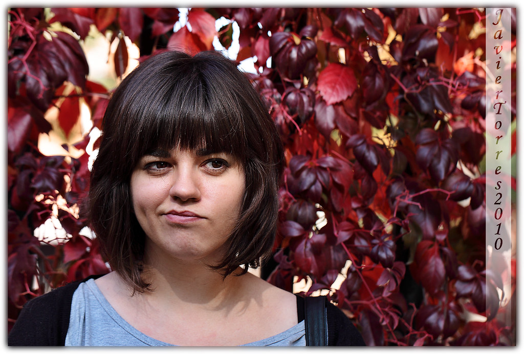
As a frontal portrait, this picture doesn’t imply any kind of movement. Still, providing air in the direction she is looking at provides a calm mood and some context, as we can see part of what she is watching. Not providing this space would have contributed to create a more dramatic mood, implying a more narrow space.
Closures:
As it has been seen previously in the negative space, the brain has the ability to fill the gaps of nonexistent things to create new concepts. Closures are a moderate example of this concept. In negative space we used existent objects to create a nonexistent concept, but in closures we use the existent object in the picture to create a shape or concept. The difference is that the shape created is not complete, has a gap, and our brain will be the one that will fill it.
Returning to our crowd from above example, imagine that now the people are forming the shape of a man. In the former example it was the gap who made the silhouette, but now are the people forming the shape of a man. The closure happens when some of the people disappear, and the shape of the man is still visible, but with some spaces in the conformation. In this case the brain will close the gaps and we will still notice the man.
The example is a little bit forced but this concept appears in many pictures in a subtle way. The shape doesn’t need to be complex, a circle or a square will work. And it can be composed by any item in the picture. So perhaps, when photographing a man in the middle of the street, the circle shape can be conformed with the shadow he casts on the ground, a tree and a near building. As long as the three elements have similar color, luminosity or contrast the brain will try to fill the gaps and create a shape. In this case the shape also works as a frame (as in the first rule), and composition can place it in any thirds, obtaining an interesting use of many rules at the same time.
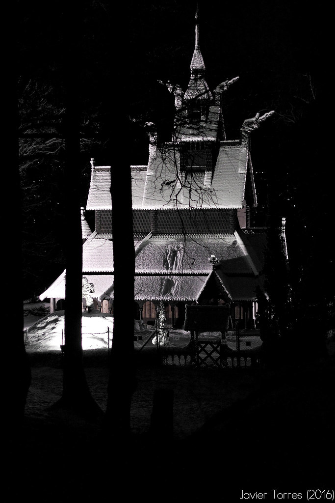
In this example, the trees, the dark sky and the low lit ground all merge together in a circular shape. The brain automatically recomposes the shape for us. In this case the shape is also used as a frame, making use of other composition rules to provide the picture of some mystery mood.
Of course, these are only a few examples of many more. But knowing them will allow you to take better pictures, to focus more on composition when working, and use them as building blocks for composing more complex dispositions of elements. Internet is full of many more examples that are worth knowing, in case you are curious.
